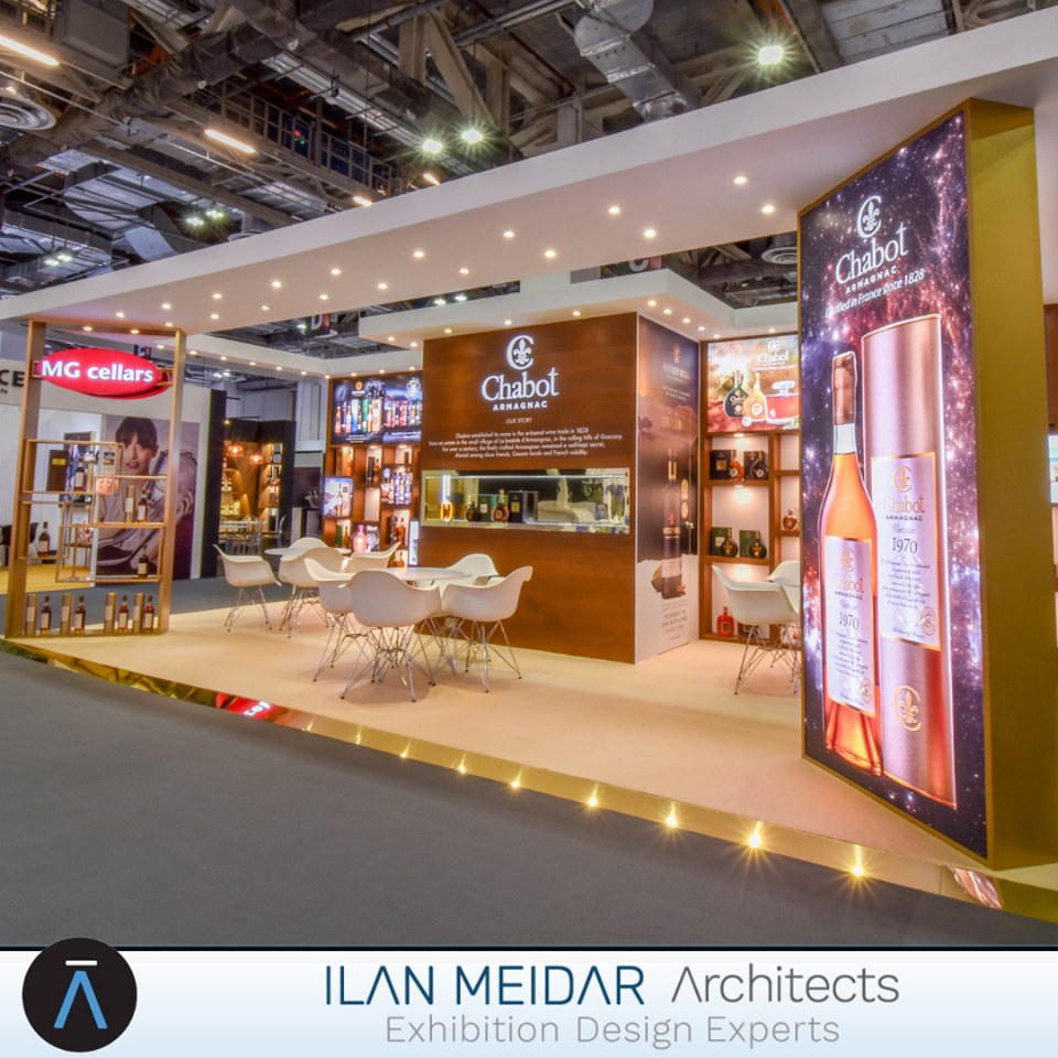
אילן מידר אדריכלים פעילה כבר מעל 20 שנה (מאז 1997 ) בתחום עיצוב תערוכות וביתנים. החברה היא חברה ישראלית ומספקת שירות מלא של עיצוב, תכנון, ביצוע, ניהול והקמה של ביתני תערוכות עבור לקוחות מכל העולם בתערוכות בכל העולם.
מבחינה שיווקית דיגיטלית המצב של החברה היה לא טוב , הלקוחות הגיעו באמצעות פה לאוזן וקשרים אישיים והכל היה טוב אבל לא יותר מזה. הנראות הדיגיטלית הייתה מזעזעת…אתר האינטרנט היה בשתי שפות אבל בתוך הדפים היה ערבוב בין השפות והתכנים לא סודרו L2R ו R2L , האתר לא קודם ולכן גם לא היו בו כניסות. דף הפייסבוק נפתח ולא תופעל, כך גם חשבון האינסטגרם , ה Pinterest ושאר המדיות החברתיות. גם סיסמאות ומשתמשים לא היו לכל ערוץ ואפילו הלוגו והמיתוג לא עודכן בכל המקומות. בשלב ראשון עשינו סדר ויצרנו אחידות בנראות – בלוגו , בשם , בהפניות בין ערוץ לערוץ, כך שמי שמגיע לאתר יכול להגיע משם לפייסבוק, לאינסטגרם ובחזרה בלחיצה אחת. בהמשך נכנסנו לפעילות ברשתות החברתיות – פייסבוק ואינסטגרם , לאחר שראינו שהאתר לא נתמך וקשה לתחזק אותו החלפנו אותו באתר חדש – בשפה האנגלית בלבד והוא מתוחזק בצורה שוטפת (מעודכנים פרויקטים ותערוכות ומתעדכן תיק עבודות ). בהמשך המשכנו לתפעול של רשתות חברתיות נוספות, מצאנו סרטונים ותכנים שצולמו בתערוכות וערכנו אותם ואת כל הסרטונים הכנסנו לערוץ YouTube שממנו הסרטונים משותפים. תוך מספר חודשים התחילו המדדים להסתדר, הן בכניסות לאתר והן בתגובות לפרסומים ואפילו הגיעו פניות ראשונות של לקוחות מתעניינים. אנחנו ממשיכים לקדם את אילן מידר אדריכלים בדיגיטל עד היום.
אתר החדש של החברה והקישורים לרשתות החברתיות
Start with speed
Mobile users are often on slower connections and less patient. If your site takes too long to load, many users will leave before they even see your content.
Even small improvements in load time can have a noticeable impact on engagement and conversions.
Improving speed should be a priority. This includes optimizing images, reducing unnecessary scripts, and ensuring your pages load quickly on real devices—not just in testing tools.
Simplify navigation
Navigation on mobile needs to be clear and easy to use. Complex menus or small tap targets create friction and slow users down.
Keep navigation focused and intuitive. Make key sections easy to access, and avoid overcrowding the screen with too many options. A simple structure helps users move through your site with confidence.
Make content easy to read
Content that works on desktop doesn’t always translate well to mobile. Long paragraphs, small text, and poor spacing make reading difficult.
Break content into shorter sections, use clear headings, and ensure text is large enough to read without zooming. The goal is to make information easy to scan at a glance.
Optimize for touch
Mobile users interact with your site using their fingers, not a mouse. This changes how elements should be designed.
Buttons, links, and interactive elements should be large enough to tap comfortably. Spacing matters just as much as size—users should be able to click without accidentally selecting the wrong element.
Reduce friction in forms
Forms are often where users drop off, especially on mobile. Long or complicated forms can quickly become frustrating.
Focus on simplicity. Ask only for essential information, use the correct input types, and make it easy to complete the form on a small screen.
A smoother form experience can significantly improve conversion rates.
Focus on the next action
On mobile, users are goal-oriented. They want to complete a task quickly—whether that’s reading, signing up, or making a purchase.
Make the next step obvious. Clear calls to action, visible buttons, and a logical flow help users move forward without hesitation.

Conclusion
A mobile-friendly website is not just a technical requirement—it’s a performance advantage. When your site is fast, clear, and easy to use, users are more likely to stay, engage, and convert.
By focusing on speed, simplicity, and usability, you create an experience that works for how people actually browse today.